Brands Matter: the BBC has a new corporate brand, why?
28 October 2021
Ex-Starbucks CEO, Howard Shultz said; “the most powerful and enduring brands are built from the heart… the companies that are lasting are those that are authentic.”
In 2021 we’ve not been short on organizations trying to reinvent themselves. From Burger King’s radical identity update, to TransferWise’s reductionist approach to become just… Wise. Plus, a thwarted attempt by GAP, pulled one week after its debut.
And then there’s the big one.
Facebook.
Which just today announced its parent company will become Meta, as part of its move to establish the Metaverse.
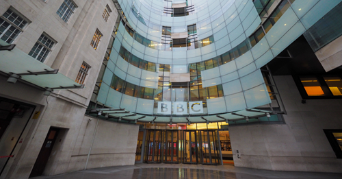
And now there’s also the BBC to consider.
The BBC’s rebrand—unveiled last week—its first in 24 years, signified a commitment to its audience on two counts: acknowledging their opinion that its identity looked “outdated” and “old-fashioned”, and delivering something with the intent of making their experience of BBC services simpler and more engaging.
Seeking a modern look
The refreshed brand brings a “modern” look and feel to the corporation, which celebrates its centenary next year. It also reflects the modest scale of its previous five updates. But its very existence undermines the intent of Martin John Lambie-Nairn’s 1997 brand refresh. This saw the introduction of the Gill Sans font, to ensure a timeless appeal, and signified a move away from its previous underlined and slanted identity.
What makes a brand?
It also undermines the essence of what makes a brand a brand? Which is, the perfect combination of brand personality—the emotional and human association to a brand and brand identity—and the image created and used to relate to employees and consumers.
This calls into question just how the BBC views its corporate brand identity, and what these changes really mean.
Aside from an attempt to address audience feedback, it doesn’t feel that representative of life in 2021. Or at least representative of the landscape in which the BBC should be present.
More than a logo
A new bespoke font—BBC Reith—will help reduce public funding costs a teeny tiny bit further downstream. Increased spacing between the blocks is designed to facilitate its application within specific services and the adjustment of the font size could also improve accessibility and optimization across different modes of consumption. But is this really the best of the BBC’s creativity? It doesn’t shout best practice in brand development and execution.
The Beeb’s last previous update in 1997 provided an opportunity for a more consistent application of the corporate identity to any BBC department, brand or service. It also paved the way for the iconic BBC One Balloon and the mischievous “2” that cantered across its sister channel. These gave each channel a definitive personality that resonated with viewers.
Unfortunately, the 2021 update has (so far) failed to “connect the dots” for the audience in the manner intended.
A disjointed experience
The roll out, which will continue into 2022, has so far delivered uniform trails across the main BBC TV channels. Yes, establishing a universal style. But also breaking the cohesive association between the various channels and the parent identity.
No refreshed or effectively integrated new channel identity packages have been introduced, as in 1997, to inject coherent personalities.
Execution is confusing. Inconsistencies across the portfolio are rife where both brands can be encountered simultaneously—particularly within iPlayer.
Alongside, a new suite of icon-centric identities for key services—iPlayer, News, Weather, Sport, Bitesize and Sounds— introduce a completely different style and creative approach.
Whilst it’s clear all have been carefully created to represent the BBC ‘blocks’, forming representations of their respective services, all – bar the weather icon – require additional explanation to provide context and clarity. For the uninitiated, it all feels like something that wouldn’t be out of place in the world of the self-satirizing TV comedy series, W1A (we recommend it, find more about it here).
Plus, you don’t have to be design savvy to recognize where the inspiration for the new BBC Sounds identity emerged… take a look here and make your mind up.
Learning from example
By design, the BBC umbrella brand has always stood apart from the individual identities of its channels, products and services, allowing each to exist as their own entities. without fusing them together. This allowed each BBC channel identity to break free of its corporate brand, whilst making it clear that they were connected and part of a unified offering.
Today the BBC has a more substantial portfolio than in 1997, and a broader array of competitors to boot. To compete in today’s multi-channel, streaming service environment, needs a clear consideration how audiences connect the dots and identify with different services.
Looking ahead
Whether the BBC’s latest minimalist approach will appeal to, or maybe appease, its core audience, will only become apparent in time. Rebrands need time to be accepted and often cause consternation at the outset.
It’s too early to say whether this is a New Coke or an Apple iMac moment. On the surface nothing appears to have changed, yet.
With the current government (reportedly) looking to clip its wings, the Beeb needs to reassure audiences that the license fee (paid by all UK TV viewers) is still good value for money. It should therefore be mindful about all the stories it tells. However it tells them. Whether through its brand communication, or through the programming it broadcasts on Sunday nights.