Spotify Wrapped: A best in class marketing campaign
22 December 2020
Every December social media buzz hits a high note for Spotify as it launches an updated version of its annual Wrapped feature giving users a snapshot into their listening habits. It’s a brilliant campaign that iterates and improves year-on-year in execution. It also provides best-in-class examples of how marketing teams should harness data, provide value to consumers, generate content, encourage product usage and integrate campaigns across media. We’ve broken down a few components of what makes this campaign so successful.
Data best practice - “Hi {name}” just doesn’t cut it
Everyone knows that pretty much all we do in the digital age is tracked in some way. There have long been stories of retailers predicting huge life events based on shopping habits, resulting in what can be described as creepy advertising. And we’ve all been victim of “Hi {name}” in an email or five. Both examples of using data to provide no value.
Yet to become commonplace is companies providing genuine (non-creepy) value back to consumers in exchange for this data. This is one of the areas where Spotify shines, particularly during the Wrapped campaign. By visualizing user data in an accessible way, they give a whole lot of value back. Not only is it interesting for people to see their listening habits, but it also gives them an opportunity to socially engage with their peers, and sometimes even show off that they’re a bigger fan of a certain artist than others or that they’re generally a more avid music listener. Music can be a big part of a person’s identity and this data enables them to express that.
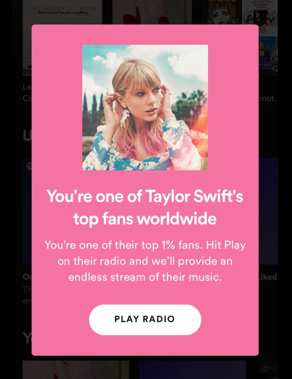
Spotify also notifies users if they’re the top listener of a certain artist, with percentages going so narrow they can let people know if they’re in the top 0.1% of fans.

In addition, Spotify also aggregates the wider listening dataset to develop creative advertising painting a picture of wider listening behavior, for example an out-of-home advertising (OOH) installation showing how many times users streamed Bonnie Tyler’s Total Eclipse of the Heart during the week of the lunar eclipse in 2017. The insights from this data are also packaged into B2B whitepapers and webinars to encourage potential advertisers to leverage the Spotify platform and audience.
This year Sainsbury’s has also utilized data to surprise and delight its customers. The UK-based supermarket chain already uses the data collected through its Nectar reward card scheme to provide more personalized offers, but this Christmas it has gone a step further. One Reddit user explained how they’d received a letter from Sainsbury’s telling them they had been the most prolific purchaser of pigs in blankets. Sainsbury’s not only gave the customer bonus Nectar points but also sent 48 pigs in blankets as a well done of sorts. The Reddit post was incredibly popular and painted Sainsbury’s in a positive light.
At Metia we talk a lot about the importance of having a fair exchange of value in your marketing activity and these are both prime examples. It’s bad practice to collect data from people and not give them genuine value in exchange.
Creating content that people actively want to share
All of the data collected by Spotify allows for the creation of fantastic content. It not only provides that coveted fair exchange of value, it’s inherently sharable. Not only for users, who want to show off their listening results (who wouldn’t want to prove themselves as one of Taylor Swift’s top fans!) but also for artists. Artists on the platform are provided with a recap on the year to share with their own fans – which pushes awareness of Wrapped even further. It’s also fantastic meme fodder with people sharing the ridiculous things they’ve listened to and creating their own versions of Wrapped referencing things other than music.
In addition, the content created is of a very high standard improving year-on-year. The 2020 edition gives users their highlights in a ‘stories’ style with colorful and creative visualizations to the backing soundtrack of the user’s top songs of 2020 within the Spotify app. It’s a frictionless user experience that encourages users to open the app and engage. And for those already in Spotify, the Wrapped 2020 tile is front and center to encourage participation.

Wrapped also lives on beyond the two-week hype window. As a feature it offers users the opportunity to add a playlist to their Spotify account that features their top songs of the year, so they can continue to enjoy their highlights as time moves on. A fair exchange of value for usage data.
Mixing above- with below-the-line
We’re yet to get a full picture of what the rest of 2020’s Wrapped campaign has in store, but social media and publications are already abuzz with users sharing their listening habits and the press covering the top streamed artists of the year.
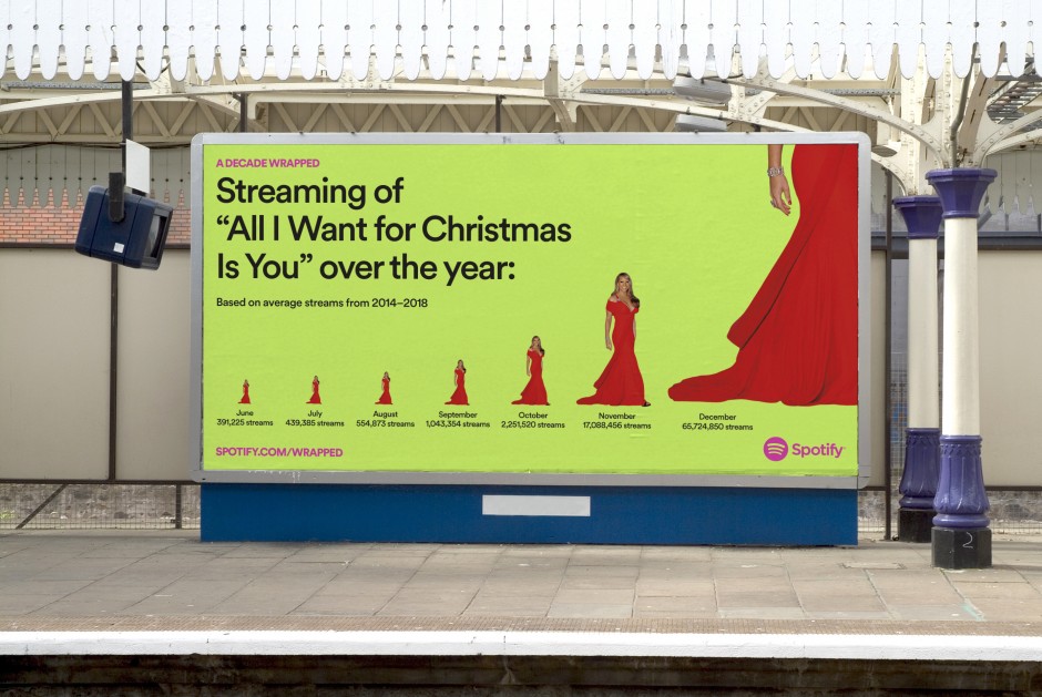
Last year saw a superb OOH execution across billboards and buses that generated additional PR itself, particularly around the streaming patterns of Mariah Carey’s All I Want for Christmas Is You.

Learning from this example
None of this work happened overnight and the success is testament to the creativity of the Spotify team. But we can all learn from this case study.
Look at what data you’re collecting – be it demographics or behavioral. How can this data be used to surprise and delight in a way that is frictionless and not deemed creepy? It could be content that makes people stop and think, a useful tool that makes their lives a little bit easier, or app personalization that reduces friction with your product. Distilling data into a clear message is critical, as reems and reems of data help no-one. And what channels can you communicate these data points through for the greatest impact?
This provision of value has positioned Spotify in a positive way with consumers – which is a contrast to how we perceive many companies who collect our data, not least the major social networks.
Spotify boils its data points down to top artists and listening minutes for the most part. The initial Wrapped campaign found people really were interested to learn about their listening data and Spotify ran with it year after year. I expect if Netflix did the same thing with viewing data people would gobble it up – we're curious creatures by nature so if you can visualize the stats in a digestible way, you’re heading in the right direction as a brand.


